Wednesday, December 11, 2013


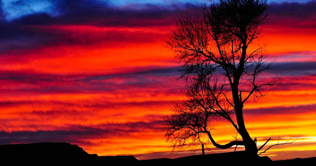
1. This photo was take by William Bender.  I really like this photo because of all the colors.  His use of the 'red' rule is great. The shadowed foreground really brings out the colors of the sunset.  The clouds aren't as sharp and clear as I would like but because of type of picture it can go almost unnoticed.  Overall, I am really drawn to this picture because of its contrasting colors and use of red.


2. This photo was taken by Riley Boyde.  This photo to me is great.  The focus of the rocks to the tree line is great.  This photo has many layers; the rocks in the foreground, the tree line in the mid ground, and the mountains in the background.  The fog and the faint outline of the mountain give this picture a sense of  mystery.  I love the subtle colors of the grass at the lake edge.  I agree with all of the settings that were used. It gave a great depth of field and kept everything in focus. Overall, I rate this a really good picture.


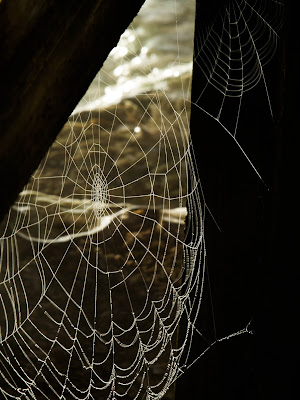
3.  This photo was taken by Alicia Cadrette.  I chose this photo because I think spiderwebs are beautiful.  I also remember talking about the trick to spider web pictures in class; by placing a back bag, or coat behind it to make it stand out. It looks like the wall served this purpose, but only for part of the picture.  The top of the web is lost in the lighter background but you can still make it out. The dew drops at the bottom of the are a little blurry. It didn't say if she used a tripod or not but with a longer exposure time one should have been used in order to get rid of the blurry bottom.  The whites turned out white instead of grey so it was good exposure settings. Overall, this is a really cool picture.


4. This photo was taken by Cole Broadus. I was scrolling through his photos and this one made me stop to take a closer look.  The cloud formation is what first caught my attention.  The white of the cloud and the mountains is great and the darker shadow under the cloud breaks it up.  On closer inspection its all kind of blurry.  Given that he used a f/13 aperture the depth of field should have given a little bit of sharpness to the mountains. Since the subject was so far away a bigger focal length may have helped. The blue of the sky contrasts nicely with the clouds and the snow. Overall, besides the blurriness, this is a pretty picture.

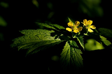
5. I already critiqued a spider web photo but as stated before, I think they are really cool.  As soon as I saw this picture I automatically fell in love with it.   The black background is great from making the dew drops pop.  Everything is in nice focus and I agree with all of the settings used in this photo.  I love this picture. 
 
 
6. This photo was taken by Tiffanie Pope.  This picture really stood out to me because it almost doesn't look real.  It looks like it was edited with a lot of contrast to make it seem this way.  Regardless of whether it was edited to be that way or not I think it works.  Because it is ice on top of tree branches the 'contrast' makes that the focus point.  Normally I would say that the snow needs to be whiter but I think that in this picture to white of snow would make the ice look funny.  The ice on the left had side of the picture has to much detail and it loses its shape.  All the ice blends together, so speckles needed to be dulled down a bit.  I think its really cool how you can see the branches through the ice and overall I think its a really cool picture.  All the settings seem to have worked nicely for this photo. 
 
7. This photo was taken by Katie Purgay.  I chose this picture because it stood out to me, mostly because I could tell what it was upon first glance.  I realized, at least I hope, that it is water with some ice around it.  Looking at the settings that were used, and her other photos it appears I was right. The settings used were f/16, 1.3 sec,  ISO 100, 160mm, and  a Tripod.The slow shutter speed gives the water the fog look. The black shadows under the ice gives the illusion that it is floating.  I would love to see the original photo just to see how it appeared before the editing.  I think the black and white gives this photo an eerie kind of feel and I personally probably wouldn't have done it, but it works. Who knows the black and white might look better then the colored version.  Besides the fact that I can't distinguish what it is its a very good picture.  The ice is very crisp and clear and the shadows contrast nicely with it. 
 
 
8. This photo was also taken by Katie Purgay.  I chose this picture mostly for the colors.  The green trees, the tan grass, brown buffalo, and blue sky and mountains all contrast very nicely.  Since the layers of the photo don't have intersecting lines or really flow together it looks as though the buffalo was pasted into this photo.  The settings used were f 5.6, 1/60 sec, ISO 200, 47mm.  The mountains in the background are out of focus.  Using a bigger aperture would have given a broader depth of field and helped make the mountains crisper.  If this photo was edited it was done very well.  The colors pop nicely but are not overwhelming.  Besides the blurry mountains I really like this picture. 
 
 
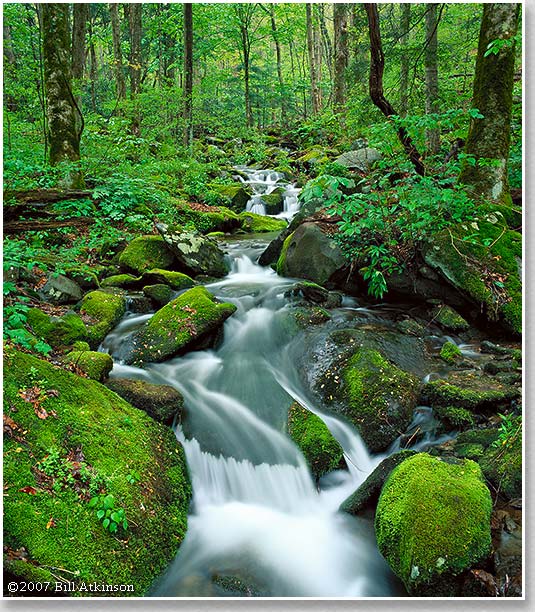
9. This photo was taken by Nancy Robinson using the following settings: ISO: 100, Focal Length: 18mm, f/10, 4.0s.  I think this picture is beautiful.  To me it looks like it should be in a magazine.  The settings work perfectly for this photo.  The closest rock is a bit out of focus butt its not the subject and is held in the foreground so to me it doesn't matter.  The reflection off the water is gorgeous and almost perfectly clear.  The long exposure time has an amazing affect on the fog. The calm water and fog give this picture a serene and calming feel. The black and white settings only make it better. This by far is my favorite photo I have seen, I love it. 
 
10.  This picture was also taken by Riley Boyd.  he settings used were f/16, 1/6",and  ISO-100. I like this photo a lot, there are some things I would do differently however.  I would cut out just a little bit of the water and add some more sky to make the picture more even, its a little bottom heavy to me.  I would also brighten the snow, I know its in the shadows but it is just to grey for me.  I think the water blur is just right. It is blurred just enough so that it isn't clear and you can distinguish it from the rocks, but also not blurred enough that it looks like fog.  The contrast of the shadowed river and lit background gives a cool effect.  I like the use of layers in this photo, the river, the tree line, then the mountains. It breaks up the photo nicely. 


These are my 30 pictures I took this semester.  All of these pictures were taken with a Canon
Rebel and either a  18-55mm or 55-250 mm lens. The photos were edited using Lightroom.   


Focal Length: 120mm
ISO- 200
 1/200s
 f/5.6


Focal Length 75mm
ISO-100
1/400s
f/4


Focal Length: 32mm
ISO-100
f/13
1/250s


Focal Length: 18mm
ISO- 100
f/4
1/400s


Focal Length: 24mm
ISO-400
1/20s
f/22


Focal Length: 18mm
ISO-100
f/4
1/1000s


Focal Length: 48mm
ISO-100
f/5.6
1/400s


Focal Length: 47mm
ISO 100
f/5.6
1/640s


Focal Length: 55mm
ISO-100
f/5.6
1/1250s


Focal Length: 95mm
ISO-100
f/5.6
1/400s


Focal Length: 75mm
ISO-100
f/4
1/320s


Focal Length: 49mm
ISO-100
f/5.6
1/250s


Focal Length: 49mm
ISO-800
f/22
1/200s
Flash


Focal Length: 47mm
ISO-800
f/8
1/200s
Flash


Focal Length: 33mm
ISO-100
f/11
1/200s


Focal Length: 55mm
ISO-100
f/5.6
1/100s


Focal Length: 55mm
ISO-100
f/5.6
1/160s


Focal Length: 28mm
ISO-100
f/4
1/100s


Focal Length: 28mm
ISO-100
f/8
1/60s


Focal Length: 25mm
ISO-1600
f/8
1/250s


Focal Length: 18mm
ISO-100
f/7.1
1/50s


Focal Length: 55mm
ISO-100
f/7.1
1/250s


Focal Length: 55mm
ISO-800
f/10
1/200s


Focal Length: 36mm
ISO-100
f/4.5
1/80s


Focal Length: 55mm
ISO-100
f/5.6
1/400s


Focal Length: 40mm
ISO-100
f/7.1
1/100s


Focal Length: 47mm
ISO-100
f/10
1/200s


Focal Length: 18mm
ISO-100
f/7.1
1/50s


Focal Length: 27mm
ISO-100
f/10
1/100s


Focal Length: 20mm
ISO-100
f/7.1
1/50s

Sunday, December 1, 2013

 
I went to Washington D.C. my junior year of high school. We were fortunate enough to be able to go on a night tour of the monuments.  I took this photo sitting on the steps of the Jefferson Memorial while looking at the Washington Memorial and the reflecting pool.  I took this picture with my old Nikon camera, it wasn't a fancy one.  Considering the camera I used I think this picture is kind of cool. If I would have edited it I could have made it look less 'foggy'.  I'm really impressed that the lights aren't blurry considering the quality of camera I used.  


Tuesday, November 26, 2013

1.  At first glance I thought that this was a picture of water with a very long exposure. Even after realizing that it was fog, I was still aw struck. I think this picture is beautiful, the way the light is shining on half of the fog and one of the mountain sides is gorgeous.  The trees on the mountains are not as sharp as, I think, they need to be. Overall, I think this picture is beautiful and there is not a whole lot that I would change about it. 

2.  This picture would be really cool if half of it was not completely blurry.  The contrast between the blue sky and the green algae is awesome and I can see where he was trying to go with it.  If only he had made the bottom as clear as the horizon it would be beautiful.  I'm not sure what he was trying to accomplish by using such a long shutter speed but whatever it was it didn't work. 

3. This is almost a perfect picture of a squirrel.  The back half of the squirrel is out of focus but that is to be expected when using a aperture of 2.8 because you lose some depth of field.  The blurred green background and the squirrels brown coat contrast nicely.  The front half of the squirrel is in nice clear focus.  Overall, this is a really good picture. 

Monday, November 25, 2013


I visited Costa Rica my senior year of high school and we got the opportunity to do a bunch of amazing things.  One of them was to hike to the La Fortuna Waterfall.  I took this picture with my phone and besides the people in the bottom I really like it.  The top of the picture is a little overexposed and makes it look kind of foggy.  This is the original picture.  The main thing that I really like about this picture is how green the tree in the foreground turned out.  If I were to edit it I would crop out the bottom and fix the the overexposure then a little touch up here and there to highlight some colors.  Overall, I think it turned out great for being a phone picture.

Tuesday, November 12, 2013

I took this picture during my trip to Columbus.  I found a bush of these berries and thought of the "red rule" of photography; that people are more attracted to red.  I thought that the red berries and the red-purple stems would make good contrast to the green leaves.  This is the edited version of the original. I cropped out some of the unfocused leaves in the corner to get rid of some distraction. Overall, I really like this picture and think that it turned out really cool.

Wednesday, October 23, 2013

I took this picture in my front yard. I woke up to a frost and the clover in the yard looked really cool.  If I could I would go back and take out the piece of grass that is at the very front of the picture, it distracts from everything else.  The edges of the main clover are blurry because I used a f/5.6 where I should have changed that as well in order to make the whole flower crisp and clear.  Other then that I love the frost and the overall look of the picture.

Monday, October 21, 2013

I took this picture in Columbus, MT. It was just one of those pictures that I was messing around with the settings and trying to get used to my camera and it turned out kind of cool.  I like the bright colored leaf it catches my attention first. I used a f/5.6 so the corners of the picture aren't as sharp and in focus as the center.  Overall, I think this picture turned out kind of cool, for the first try.

Thursday, October 3, 2013


I was just looking around online for some cool picture and I came across this one.  I chose this photo because the shading and light are make it that much more unique then other flower pictures. The light emphasizes the subject of the picture and highlights it.  Where the shading gives it more texture. The link to this picture is actually to a great article. It is a crash course for beginning nature photographers and various tips on how to get the best pictures.  A lot of what the article says is what we have discussed in class, about knowing you equipment and you subject. The link is below, Enjoy!  http://www.wildernesscollege.com/nature-photography-for-beginners-article.html

Tuesday, October 1, 2013

#1. The water is white, the bear is clean and crisp, the fast shutter speed caught the water at a good time.  Overall,  I like the picture very much, I don't think I would have done anything better.  The appropriate ISO was used. I really like this picture. 

#2. The first thing that caught my attention was the yellow leaves in the bottom left corner (which is apparently what females tend to notice more).  The tree in the right had corner leads into the picture well. The moving water has the "fog" effect, meaning a slow shutter speed was used, which according to the picture was a 1.6seconds.  The colors are very bright, and reflected in the water.   Overall, I think it is a beautiful picture.

#3. The photographer use of white versus black is amazing.  Neither the black or white turned out grey due to under/over exposing, so I'm assuming they edited it, manually exposed it, or used some sort of polarizer or filter (or maybe all the above).  I think this picture is really cool, but not one of my favorites. 

#4.  The ten second exposure gave the mountains a very looming, yet gorgeous effect.  The mountain is very sharp and in focus yet the stars are blurry. The fading of the sky from dark blue to lighter blue leads me to believe that the photographer used a graduated filter.  It is a breathtaking picture, but to me it looks fake. 

#5.  The bright colors of  the water draw my attention right away.  I noticed there are some plains going on.  The mountains in the background, the blue sky, the slanting hill, and the foreground with the hot water spring.  I love the colors.

#6. I love bright colors, so I especially love this picture. The bird, being the center of focus is clean and crisp, where the branches are slightly blurred. Everything ties in really well together and complements each other.

#7. The first thing I noticed was the the water and the bear are not in focus, nothing is really in focus. The water is blurry, meaning a lower shutter speed then should have been used. Overall, I think it is a cool picture, would have been 100x better in focus.

#8.  Red is the most attractive color to the human eye, this photographer did a nice job incorporating that in.  The contrast of the green and red gives it an extra pop.  The sun in the back corner rounds out the whole picture.  Looks to me like this is a composite picture, but it is beautiful non the less.

#9. The water is nice and crisp but the wings that are the closest are blurred.  The photographer focused more so on the lower body of the bird rather then the whole thing.  If they could have managed to get it all into focus, the picture would have been perfect.

#10. The polar bear in the foreground is nice and clear, to me the background is kind of boring, besides the other bear. Personally would have left all of the flat, white tundra out of the picture. The snow turned out white instead of grey, so the photographer manually overrode the exposure. If is a nice picture. 

Thursday, September 26, 2013

Every year my family goes four-wheeling a little ways outside of Absarokee.  This waterfall was right next to the road. I took it on my phone while I was sitting on the four-wheeler. The top half of the picture is a little gray because my camera was trying to underexpose the sun. The sun also caused the  'glare' in the top corner of the picture that we talked about in class. Other then that I love this picture, the yellow bush in the center of the image really draws my attention.  Even though the water is moving I think my phone did a pretty good job of capturing it.

Wednesday, September 18, 2013

Since we started discussing our trips in class I decided to show a little preview of Ireland.  This is Kylemore Abbey, a 1920 monastery in Connemara, Country Galway, Ireland.  Even though it doesn't have the blue sky that we talked about in class it is still a breath taking picture. I chose this picture because I have always wanted to go to Ireland and see the castles.  

Wednesday, September 11, 2013


I found this nature photographer online. He takes some of the most beautiful nature pictures I've seen. His name is Bill Atkinson. Along with designing some of the initial Macintosh interface and MacPaint, he has done some incredible work and traveling. The link to his website is below and you can look at more of his pictures and read more about him.  http://www.billatkinson.com/CatalogIndex.html  

Wednesday, September 4, 2013


To be honest I am not entirely sure where I took this picture or which mountain range that is. I was traveling with my family and I took this out of a moving car with my phone. I really like this picture because the mountains are bright while the storm clouds are rolling in.